Project: Fitpeaks
Role: Visual Design, branding, printmaking
Duration: Aug – Sep 2020
Project Vision
Gym members use their FitPeaks App to check-in at their favourite sports club. With every visit they collect ‘FitPeaks’ which can be exchanged for products and services at (local) entrepreneurs. The main purpose of the app is: encourage gym members to exercise more and to help them stay motivated, connect gym members with the local community of entrepreneurs.
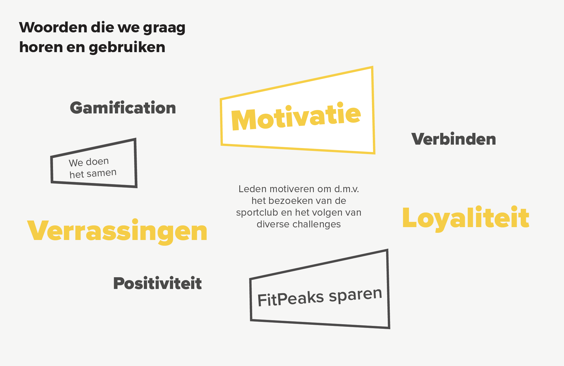
Core values: motivation, positivity, cheerfulness, surprise, connecting, cross-pollination, gamification.
Challenges
1) Create a recognisable branding foundation for on- and offline purposes.
2) Create easy-to-understand visuals explaining FitPeaks’ concept.
3) Making a big impact with a small team.
Kickoff
Starting off, I asked myself a few initial questions. Who is the primary user? What kind of goals do they have? Why would someone want to identify themselves with this brand and make use of the application? How to target a very broad user group? Just how large of a scope do I want this project to be? After several chats with the stakeholders, and a questionnaire to get the scope right, it became evident that the goals they wanted to accomplish all fell within the same category; a general foundation and recognisable bubbly but trustworthy brand to start with, so they can build their fitness saving application empire in the next five years.
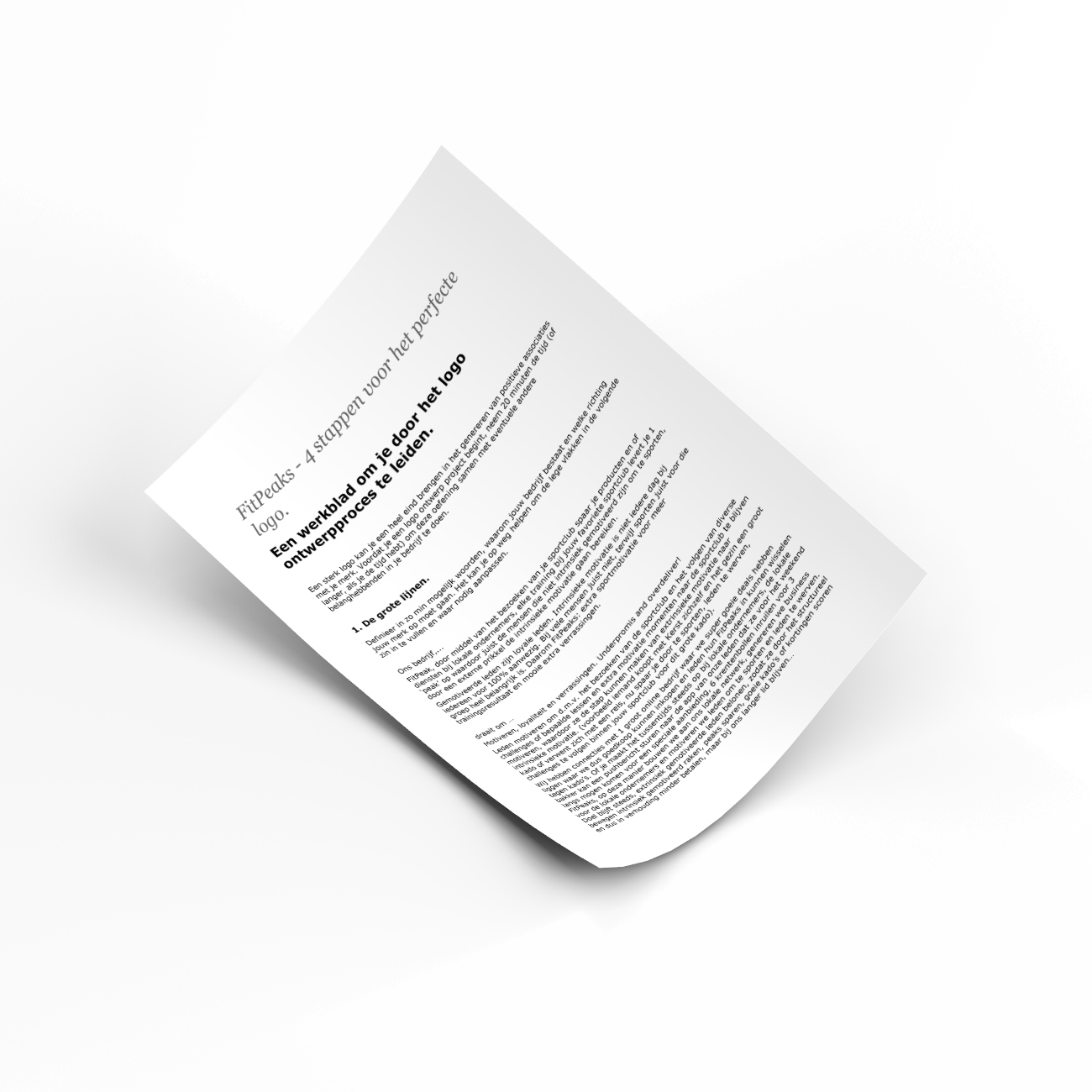
The questionnaire is called ‘4 steps to the perfect logo’ and it’s a great tool to get the client really think about what they are after and looking for in a logo design. This understanding speeds things up in the process.
Competitive Analysis
FitPeaks ‘saving’ concept is new in the fitness industry.
In order to construct a concise and solid foundation for them, I had to venture out and see what other prominent ‘saving’ applications were already doing and understand how they communicate their message to get members to subscribe. I evaluated several competitors deemed vital and identified two major players from which FitPeaks can learn from in order to have a great start in this concept.
I found that only two of the four main competitors can be used as a reference in how to communicate this concept clearly. Piggy and AirMiles have a modern and easy to understand communication that will be used as a reference.
Meet the users

Name: Jessica Peters
Age: 24
Occupation: Hair dresser
Jessica is a busy hair dresser during the day, and is also attending advanced courses in the evening. She puts a lot of effort in her appearance. She knows the importance of getting enough exercise and thinks it’s a great way to stay in shape and maintain her social life.

Name: Gert Jeukens
Age: 67
Occupation: Retired
Gert is retired and likes to spend time with his grandchildren. The doctor advised him low-impact sport which can help reduce the risk of cardiovascular disease, lower blood pressure, and improve mobility. Plus, the teamwork component makes for a great social activity.

Name: Aalina Meskin
Age: 36
Occupation: Administrative Employee
Aalina works at the hospital as an administrative employee and enjoys the working environment. She loves to catch up with her friends and explore the neigbourhood for great places to eat and shop. She loves to play games on her smartphone to pass the time.

Moodboard
Mood boards are the perfect jumping off point for any design project. Creating mood boards allows you to collect thoughts, ideas, color schemes and moods in one place and define a coherent design concept without risk of losing sight of the bigger picture.
Logo concept
The logo needs to communicate a modern and trustworthy message. It is a money saving app, where you can get ‘free discount’. The brand needs to give the necessary reassurance that there is no catch, or that they will get tricked into something dodgy.
There is also a special meaning behind the word. The PEAKS in FitPeaks sounds in a way similar to ‘pieken’ in Dutch, which means ‘money/value’. And the English ‘to peak’ (in Dutch again the same word: pieken) is to reach a highest point, either of a specified value or at a specified time. This all gives a good opportunity to sketch some designs where the FP initials might as well be a currency.
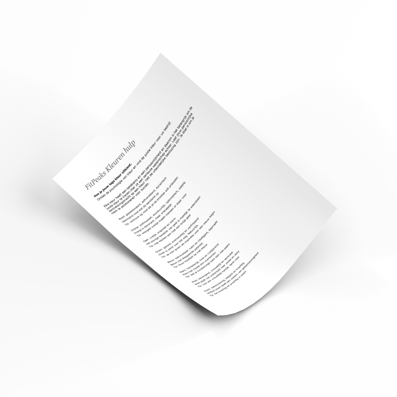
Because of the ‘money/value’ behind the brand, the client wanted had a preference towards yellow/gold colour.
Logo design

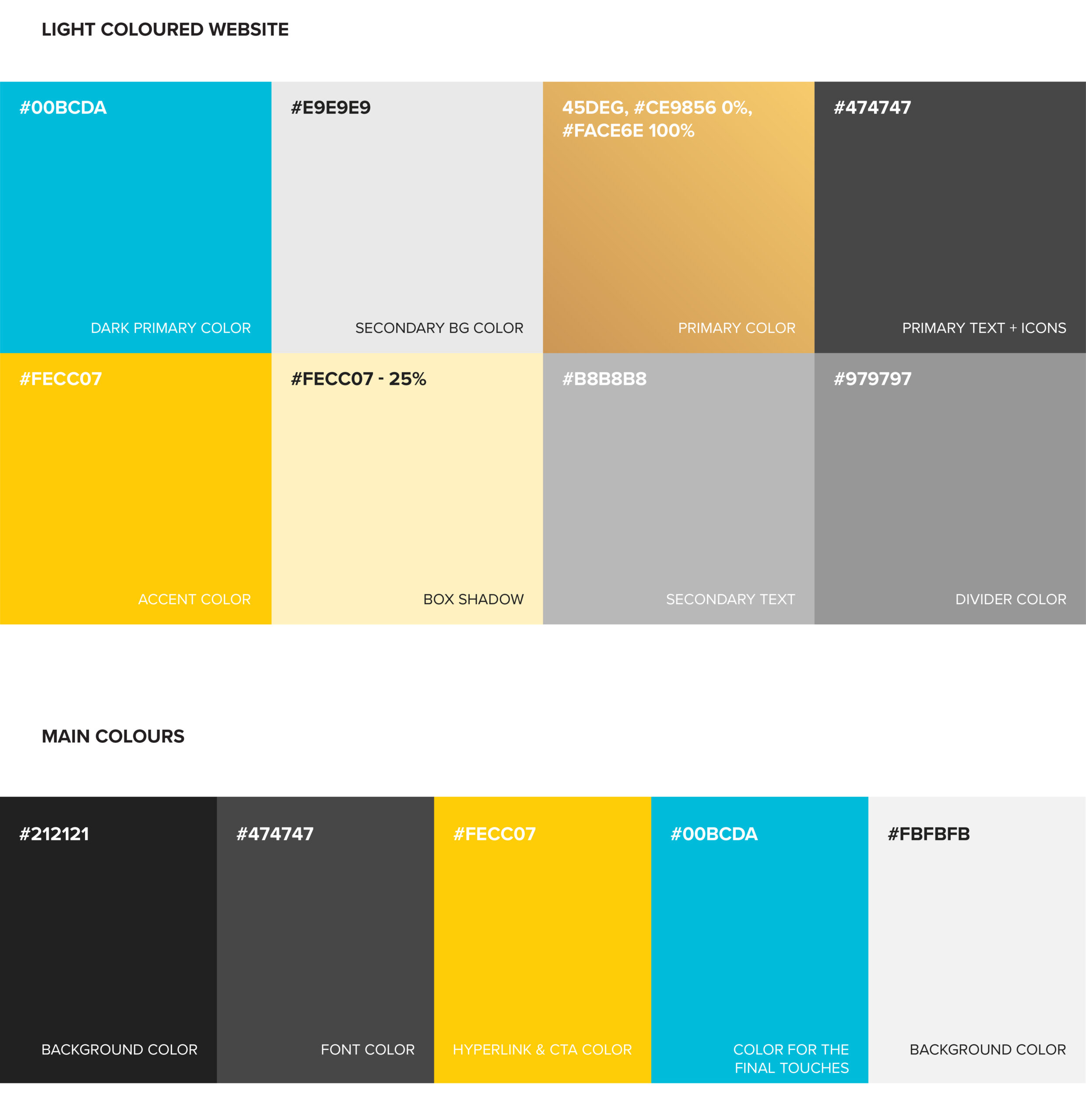
Brand style guide
FitPeaks brand style guide, is a document that sets specific guidelines for perpetuating brand identity in all external and internal communications. This can be used to maintain a consistent brand throughout all channels

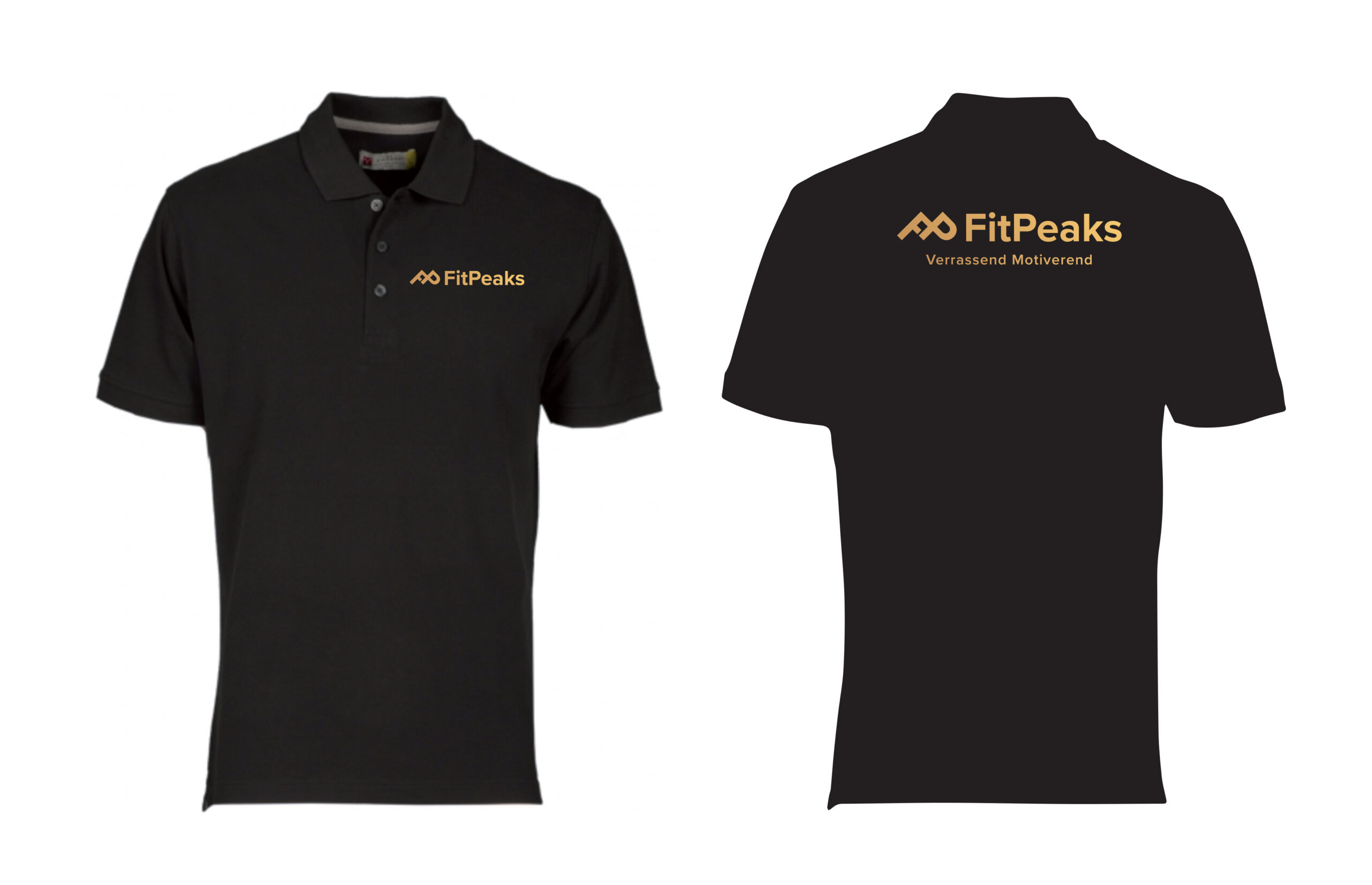
Marketing collateral
The biggest reason to invest in marketing collateral is simple: it helps you tell a story. Marketing collateral helps you tell a consistent story to potential customers.
A few of the many deliverables created: logo design, brand guide, Facebook page, Polo shirt, brochures, flyers, posters, rollup banners, flag line.


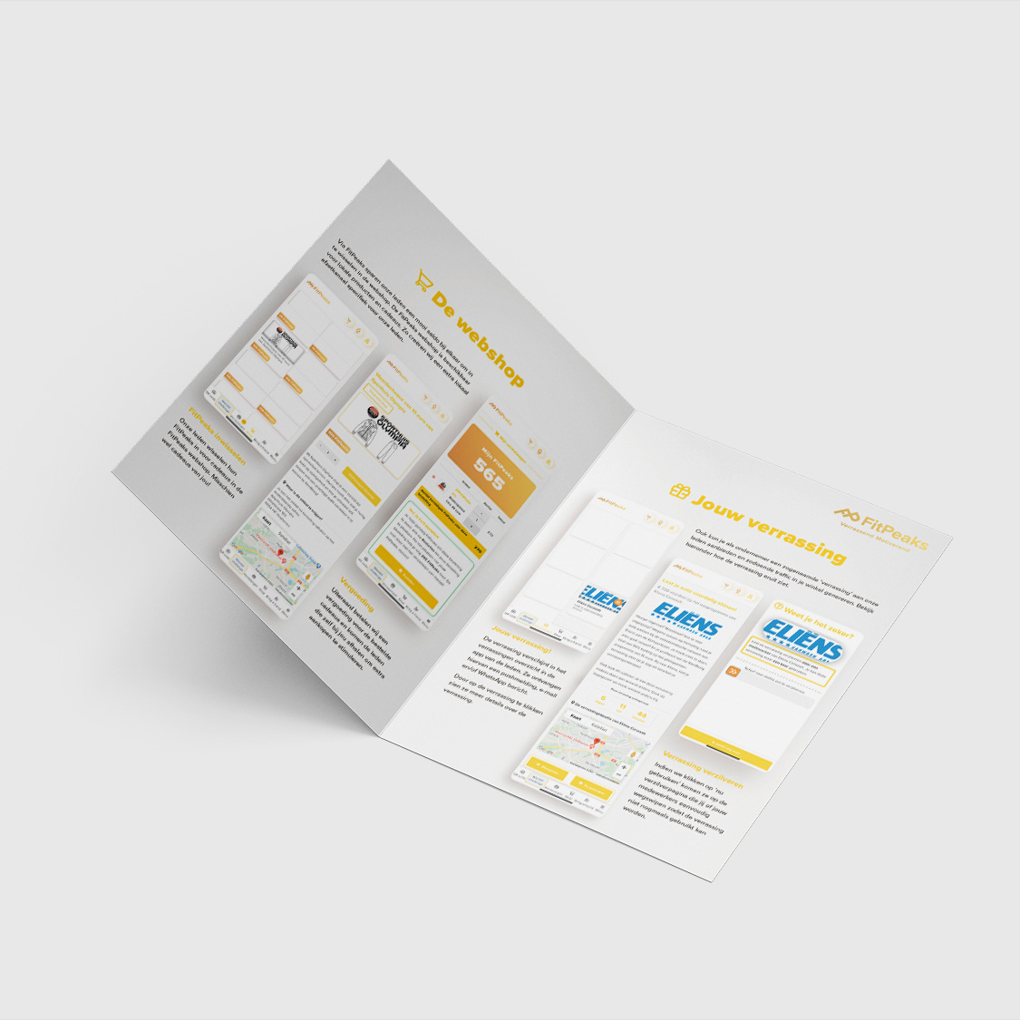
B2B Brochure
FitPeaks helps local entrepreneurs to get more customers and to reach higher turnover in their store. This brochure is created for the purpose to inform them how to get their shop and/or service in the FitPeaks application.
Challenge: create a high quality brochure where the FitPeaks employees can adjust the logo themselves.
Solution: this brochure is created in Indesign and then exported to Canva. This makes it much easier to include the shop’s logo, and order the prints themselves.

How nice of you to drop by! Let's get in touch and tell me how I can help you get some design related work off your plate.
MEET SANNE
NEED HELP?